CSS Grid provides a distinctive way to distribute a group of elements within a web page within a grid consisting of a group of cells that can be filled with content in a variety of ways.
The grid structure in CSS is similar to the table structure in HTML, but provides greater flexibility and provides a faster and easier way to build any website and organize its elements. The most prominent feature of the grid display method is that it saves a large amount of space on the page, especially when displaying a large number of items in it, in addition to being considered a more professional method than displaying items in a traditional list format.
In today’s article, we will learn in detail how the method of distributing elements in these grids (CSS Grid Layout Module) works, and we will apply it in practice on our WordPress site to display the site’s articles in an elegant grid layout through ready-made plugins or through software code.
Basic properties of a CSS Grid
The CSS grid is similar in structure to the concept of a table in the HTML language, as it contains a form similar to a table consisting of rows or lines (Rows), Columns, and Cells resulting from the intersection of the lines and the columns.
But the grid structure additionally has a set of additional components or properties that make it more flexible and more customizable in displaying elements from tables, as shown in the following image:
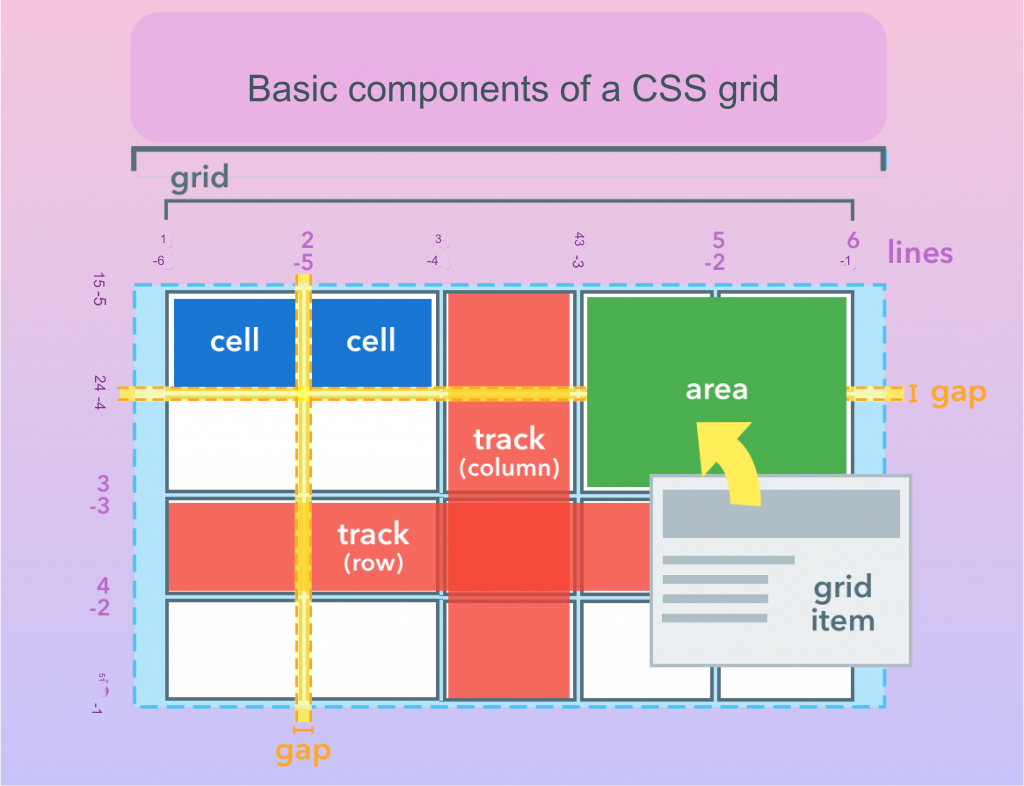
Here is an explanation of the most important of these characteristics:
- Trackes:A track is a full line (track row) or track column (track column) in the grid.
- Area:A region is an area extending over more than one cell in the grid. Multiple regions or spaces in the grid can be named to fill them with elements.
- Lines: The horizontal and vertical lines of the grid are used to define paths and areas in them. As you can see, the grid lines can be numbered positively when counting from left to right and from top to bottom, and negatively if we count them in the opposite direction, then we number the last line and last column with 1-
- Gap :Space represents the space between columns, or between lines.
- Grid itemes:An element is the actual content of the page that is displayed within the grid areas.
Programming examples of using the CSS Grid
To define a CSS grid within your code, we basically need:
1- A container element to hold a group of elements within it (for example a div).
2-Then we apply the following format to this container: display: grid or display: inline-grid, to make the elements in it arranged in a grid distribution.
3- We specify the values of the grid properties, and the two most important properties are specifying the number of columns and lines for this grid by passing values to the grid-template-columns and/or grid-template-rows property according to the grid model we want.
Note : The values of the network properties can be passed in multiple ways (the values must be separated by spaces). The units of measurement for the passed values can also be specified in different ways, such as a specific measurement in pixels, a percentage, or a portion of the free space in the network using the fr unit, or automatically, as we will see in the practical examples.
If you do not specify a specific value for a network property, then the value of this property will be set to its default value in the network.
4- Determine the sizes of the spaces separating the lines and columns. We can use the following properties (grid-column-gap, grid-row-gap, or grid-gap).
5- Now we have to choose the actual elements we want to place inside the container by telling the CSS in which column and which row each element begins and ends.
Example: To create a CSS grid of 3 columns and 2 lines linked to the container element called my-container. We write the following code:
Note: The repeat function allows usto create a pattern for repeating lines or columns in which we specify how many columns or lines we want to add to the grid (they must have the same size). As it takes two arguments, the first specifies the number of repetitions and the second specifies the value or measurement that we want to repeat.
In this example, we used repeat to repeat columns/lines, through which we defined 3 equal columns so that the width of each column is 1fr, i.e. part of the free space available in the container (one-third of the width of the container), and we defined two equal lines so that the line height is (half the height of the container). .
Then, if we want to insert an element, let it have the id .element inside the purple-shaded area in the grid, as it is located in the following image:
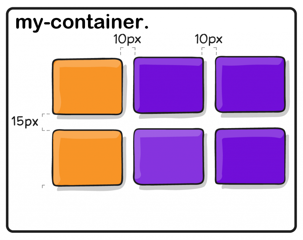
We can do this by writing the following code:
Label regions in a CSS Grid
There is a nice feature in the CSS grid, which is that we can create typical areas in it through the grid-template-areas property, so that we place them below the two properties responsible for setting the number of lines and columns, and give these areas distinct, meaningful names (such as header or main), and then use these names To programmatically place items in those areas easily.
Example 2: We will create a grid consisting of four columns and three lines. So the header area occupies the entire top line of the grid, the main area occupies the first 3 cells of the middle line, the sidebar occupies the last cell of it, and the footer area occupies the entire bottom line.
Based on this model, elements can be distributed within regions later using only the region names without the need to specify the beginning and end lines and columns, as follows:
After learning about the basic elements and characteristics of the network, it will be easy for you to understand how the network is set and used practically on WordPress sites, as we will explain in the following paragraphs:
Using CSS grid in WordPress
Using a wireframe layout on a WordPress website gives you a lot of flexibility in displaying content. For example, you can display the latest articles on your site within a grid, for example, or create elegant photo galleries for images in your site’s media library or elsewhere in a professional and distinctive grid format.
If you plan to use a CSS grid, you can do so using ready-made plugins or by manually writing the code in the template files, knowing that there are some WordPress templates that directly adopt the grid layout, and you can search for this type of template by typing (Grid WordPress Themes).
In the following paragraphs, we will review two ways to include a grid on your site through one of the ready-made plugins or through code if your site template does not automatically support the grid display feature for elements..
Using the wireframe layout on a WordPress website through plugins
There are several free plugins in WordPress that enable you to include a grid layout on your site. The most prominent of these plugins are:
1. Post Grid add-on
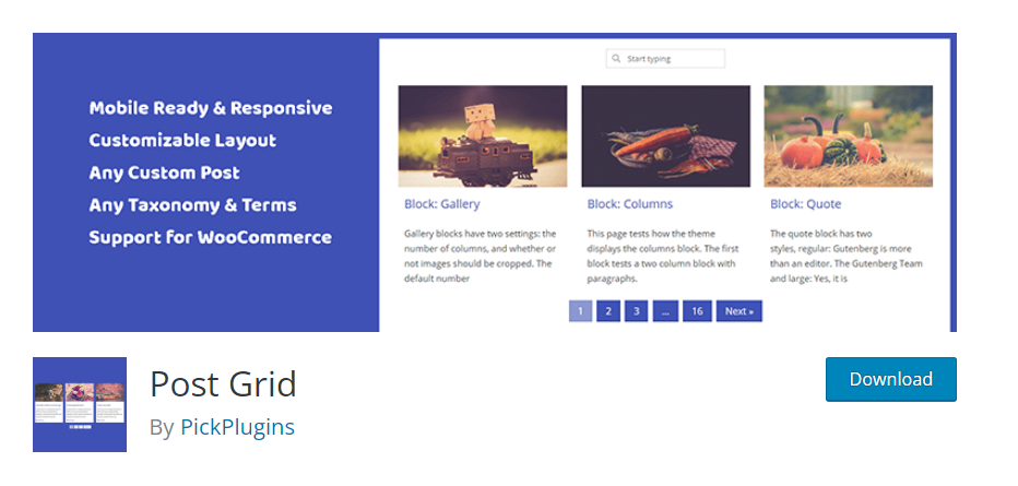
This add-on enables you to display your site content in a grid layout in a quick and easy way. Through it, you can specify the number of columns that your grid will consist of and choose the content that you want to display in a grid form from your site (such as articles, static pages, article archive pages, and other parts of your site).
This add-on is available in a free and paid version that provides more features and provides greater control over the appearance and content of your networks. In order to be able to display photos and videos in a grid layout, you need to upgrade to the paid version of the add-on.
You can also filter the content you want to display on the network. For example, you can display only articles that have a specific category, or those that were written by a specific author, or exclude certain pages from displaying in the grid, and you can also set the maximum number of articles or other options.
2. Add Content Views
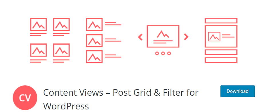
If your WordPress theme doesn’t give you enough control over how your posts and page lists are displayed, Content Views provides you with the functionality you need. It is a simple free plugin dedicated to creating custom grids and lists to display your content in WordPress.
Once you activate this add-on on your site, all you have to do is choose the content that will be displayed in your grids and lists (the latest articles, articles with a specific category, or articles written by specific authors).
You can also easily choose the specific elements you want to display from your articles and pages, such as (title, featured image, and description). It has several display layouts available (Grid layout, Masonry layout, Carousel layout).
3. Grid Plus add-on
Grid Plus is a free plugin that provides a grid layout for WordPress. This plugin has an easy-to-use interface, provides you with three different grid styles to choose from and also enables you to control the number of columns and rows that make up your grid.
To add content to your grid, you must choose the data sources available on your site (such as your articles) that you want to display in a grid layout, and then assign filters to control the displayed elements.
You can then preview the grid layout and make other changes to its appearance such as changing colors, rearranging elements, and applying your choice of animation effects to it.
This add-on has a professional version that allows you to access more functions such as importing the grid layout from another site, exporting to a new site easily, and other professional features..
The networks produced by this add-on also have a clean, modern appearance and are responsive to mobile devices, which makes them one of the most popular and used add-ons. Below we explain how to use this add-on on a WordPress website with practical steps.
Experience using the Grid Plus add-on
In this paragraph, we will use the Grid Plus add-on to convert the display of site articles from the traditional view (in the form of a list of articles) to a grid view without the need to write any programming code by following the following steps.
1- Go to your WordPress site’s control panel and choose Plugins < Add New < and type the name of the Grid Plus add-on in the search box, then install and activate the add-on on your site.

2-After activating the add-on, a new tab named Grid Plus will appear in your site’s control panel. Click on this tab and choose from the menu that appears the option Add grid . A window will appear containing several tabs through which you can customize your network the way you want. Here are the most prominent of these settings.
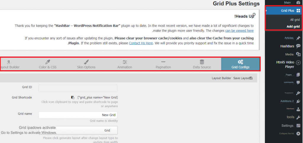
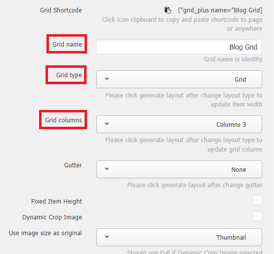
3- Grid Configs tab : Through this tab, you can specify the name of the network in the grid name field (the name must be distinct and specific to each grid you add to the site). We will call it, for example, Blog Grid. You can choose from the Grid type drop-down list the type of network to be Grid.
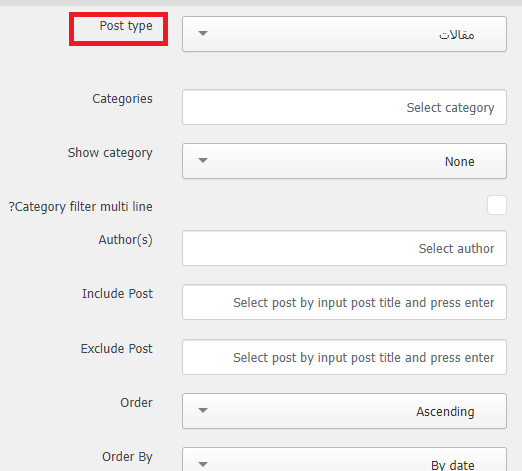
5- Data Source tab : Through this tab you can choose the items that you want to display within the grid through the Post type drop-down menu. Here we will choose articles because we want to display the site’s articles in a grid format.
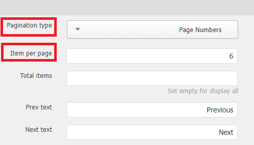
6- Pagination tab: This tab helps you determine the method of moving between pages, pagination type, if the items are displayed on more than one page. We will choose from the drop-down list the option to display the page number, and we will specify the number of items on each page, item per page, to be 6 items, for example. Example.
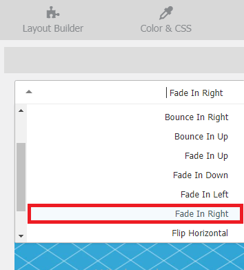
7- Animation tab : Through this tab, we can determine the animation effects through which the network elements move at the moment they appear. We will choose the Fade In Right effect for our grid.
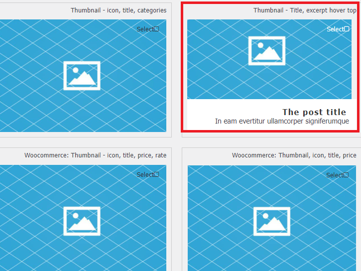
8- Skin Option tab : From here you can specify the appearance of the elements that will be displayed in the grid and the way they are distributed.
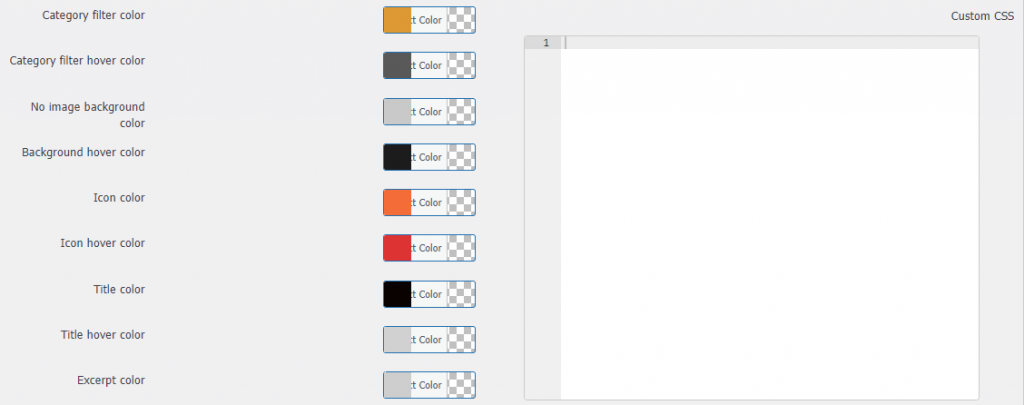
9- Color & CSS tab: This tab enables you to add a custom color to the grid, as well as add custom CSS formats as you wish.
After selecting all the options you want, click the Generate Layout button on the Layout Builder tab to create the general grid layout based on the options you selected.
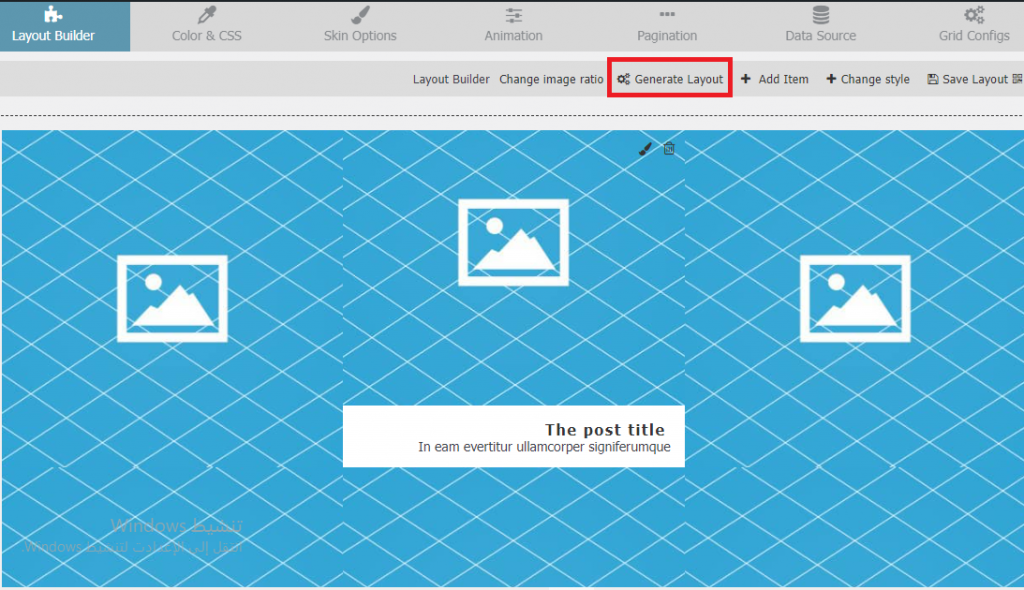
After creating the grid layout, you can still change the appearance of the grid by clicking Change style in the toolbar above the layout, and you can also change the aspect ratio of the element so that the height of the grid element is based on the width of the item Items Ratio X:Y
For example, if the width of our grid element is 250 pixels, and the Items Ratio is 4:3, the height of the grid element will be approximately 188 pixels.
Once you have customized all the grid options as you want, click the Save Layout button to save the grid.
10- Now to use the grid layout, go again to the Add tab on the control panel, click on it, and choose All Grids. A window will appear showing you the ID, Name, and Grid Shortcode for all the grids you created before.

Click the clipboard icon to copy the shortcode for this network. Now you can paste this code anywhere on the page or in a particular widget to display it within it.
11- Now open any page on your website in editing mode, or add a new page titled (Article Grid) on your website, add the short code component to it , paste the code you copied into it and save the changes.
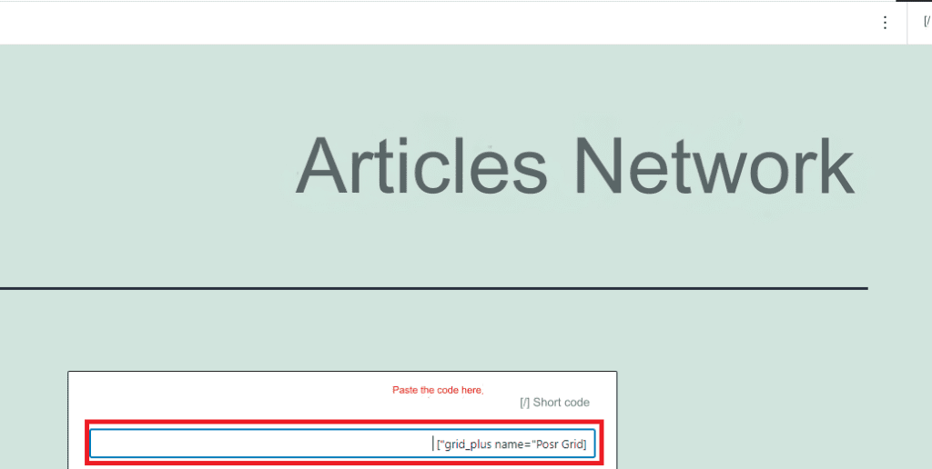
That’s it! All you have to do now is browse this page, and you will see that the articles are now displayed in a professional and elegant grid according to the options you selected on your website.

Using wireframe layout in WordPress through code
In this method, we will explain to you how to create a CSS Grid through code, as we explained at the beginning of the article. We will modify the template files to display the articles on the blog page and archive pages in a grid format instead of displaying them in a list format.
We will apply the following steps to the GeneratePress template installed on the site, but you can simply modify the parameters in the CSS code according to the template you use on your site.
1- Go to the site pages that display a list of articles (blog page and archive pages), right-click on them and choose Inspect to find out the ID or row of the container in which the template displays all articles.
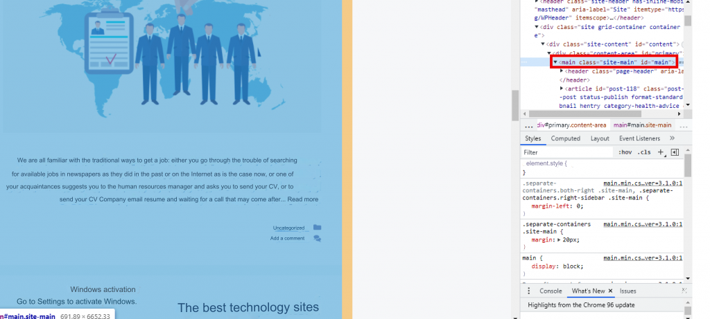
As shown in the previous image, in the case of our template, the container is a div with id=” main. ” So we will give this container a grid layout by going to the site’s control panel, choosing Appearance > Customize > Additional CSS formats and writing the following code:
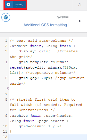
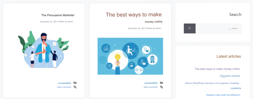
After adding the code and clicking the Publish button to apply the formats, you will now notice that the articles are displayed on the site in a grid instead of being displayed in a list under each other, as shown in the following image.

Grid elements can also be formatted and given a professional look and format by formatting the container that contains each article (which in our case is a div with id=”.inside-article”), so we will format them as such by adding the following code in the Additional CSS formats field after Immediately preceding code:
This code creates the article card design, hides article excerpts, and specifies the aspect ratio: 16/9 for article images and other formats… so that the articles appear within the grid after applying the previous code in the following professional form:
Conclusion
Thus, in today’s article, you have learned about the CSS Grid layout, which is an effective way to display posts, pages, and media on your website. It is an elegant layout and saves a lot of space at the same time. This type of format is most common on photography websites or photo galleries, but of course you can create a grid on any website and display whatever you want inside it.
So do not hesitate to use it on your site to give your site more professionalism in displaying content, improve the navigation of your website and improve the visitors’ experience as well. Choose the method that suits you to implement it from among the methods that we presented in our article today, through ready-made additions, through software code, or perhaps by choosing a template that supports network layout directly without any effort on your part.


Leave a Reply